
A lot of modern design is optimised to be seen rather than used.
Interfaces are polished, animated, and visually impressive, yet somehow harder to navigate. Brands become more minimal while also becoming less distinctive. Products look cleaner but feel more confusing. Somewhere along the way, many companies started treating aesthetics as the goal rather than the outcome.
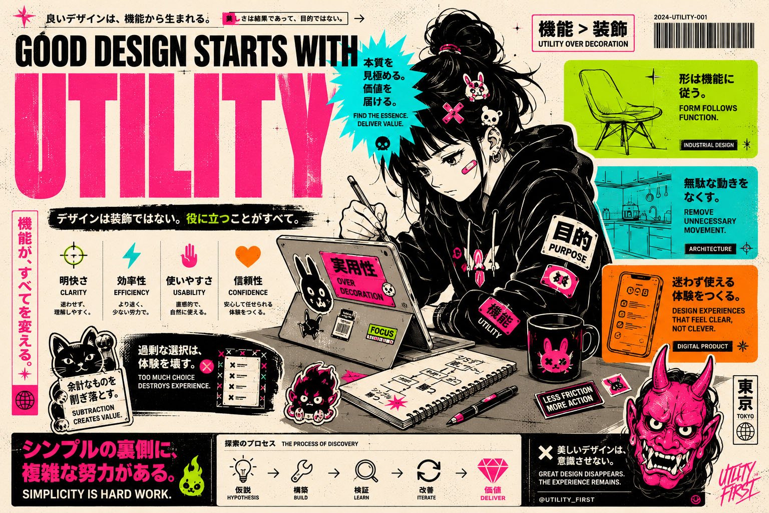
But the best design has never really been about decoration.
It has always been about utility.
At its core, design is the process of helping people accomplish something with less friction. That applies equally to software, architecture, industrial design, typography, or physical products. Good design makes things clearer, faster, more intuitive, and more usable. It reduces cognitive effort. It creates confidence. It helps people move from intention to outcome as seamlessly as possible.
When utility disappears, design becomes performance.
You see this constantly in product development. Teams spend weeks refining gradients, transitions, and visual systems while basic workflows remain frustrating. Navigation becomes clever instead of obvious. Interfaces prioritise novelty over familiarity. Entire experiences are built around what looks impressive in a design review rather than what actually helps users succeed.
The irony is that truly functional products are often the ones users describe as “beautiful.”
Not because they are visually extravagant, but because they work so effortlessly that the experience feels invisible.
That is what great design really does. It removes itself from the interaction. Users stop thinking about the interface and focus entirely on what they are trying to achieve.
The most enduring examples of design all share this principle. A well-designed chair supports the body naturally. A well-designed kitchen reduces unnecessary movement. A well-designed app helps users complete tasks without confusion or hesitation. In each case, the value comes from function first. The aesthetics matter, but they emerge from clarity and purpose rather than being layered on top artificially.
This does not mean visual design is unimportant. Far from it. Aesthetics influence trust, emotion, and perception. People are naturally drawn to products that feel considered and coherent. But visual design should reinforce utility, not compete with it. The best interfaces guide attention intentionally. The best brands communicate clearly. The best products create simplicity on the surface while handling enormous complexity underneath.
Utility also requires restraint.
One of the clearest signs of weak design is unnecessary complexity. Too many options, too many interactions, too many features, too many decisions. Designers and product teams often add because adding feels productive. But genuinely useful design is usually the result of careful subtraction.
The question is not:
“What else can we include?”
It is:
“What can we remove without reducing value?”
That discipline is much harder.
Functional design requires empathy because utility only exists relative to the user. A workflow that feels efficient to the team building it may feel overwhelming to everyone else. That is why the best designers spend so much time observing behaviour rather than defending opinions. They care less about personal taste and more about whether people can intuitively understand and use what they create.
Ultimately, utility is what gives design longevity.
Trends fade quickly. Visual styles change every few years. What feels modern today often feels dated tomorrow. But products that are genuinely functional tend to endure because they solve real problems clearly and consistently.
People rarely stay loyal to design because it looked interesting.
They stay loyal because it worked.
And in the long run, that is what great design has always been about.