When making custom interfaces I’ve seen it over an over again where the interface becomes a linear “story”. You might have seen it yourself – ever had software that has a lot of next/previous/back buttons?
When speaking to users about their workflow routine, it’s common to hear them describe a process from start to finish, with a clear entry point, a procedure in the middle and a clear exit point. This then unintentionally translates to the interface design as a linear story and the navigation follows. Enter your information. Then click next. Tick that box. Click next… Click next…
What you have designed is a survey form. This is not how good Product works. Users live in a distracted world and do not always stick to their rigid workflow – they jump around, work on different things, items are in different parts of the process at different times. Imagine taking a photo with a camera app on your phone – in research, you might find a user takes a photo, and then looks through their photos after that to check the photo they took. So you might design the interface as 1. take photo -> 2. View camera roll. But we all know that we often go straight to the camera roll, so providing ONLY a linear navigation structure is simply not right, even though users may have said that’s how they would want to use a camera. We have to be able to imagine the different ways users might want to get to their intended goals as quickly and easily as possible.
So instead of a linear navigation, I would strongly suggest you use a hierarchy. You need to identify what a user wants to do as clearly defined intentions, and then allow them to navigate to those intents or pages in a non-linear way. This can be done through hierarchy. Using a flatter structure, with ways for the user to jump around and do things in a different order depending on what they fancy. You could even use a weighting exercise to determine the priority of the navigation system to make sure the most commonly accessed pages are at the top of the navigation hierarchy.

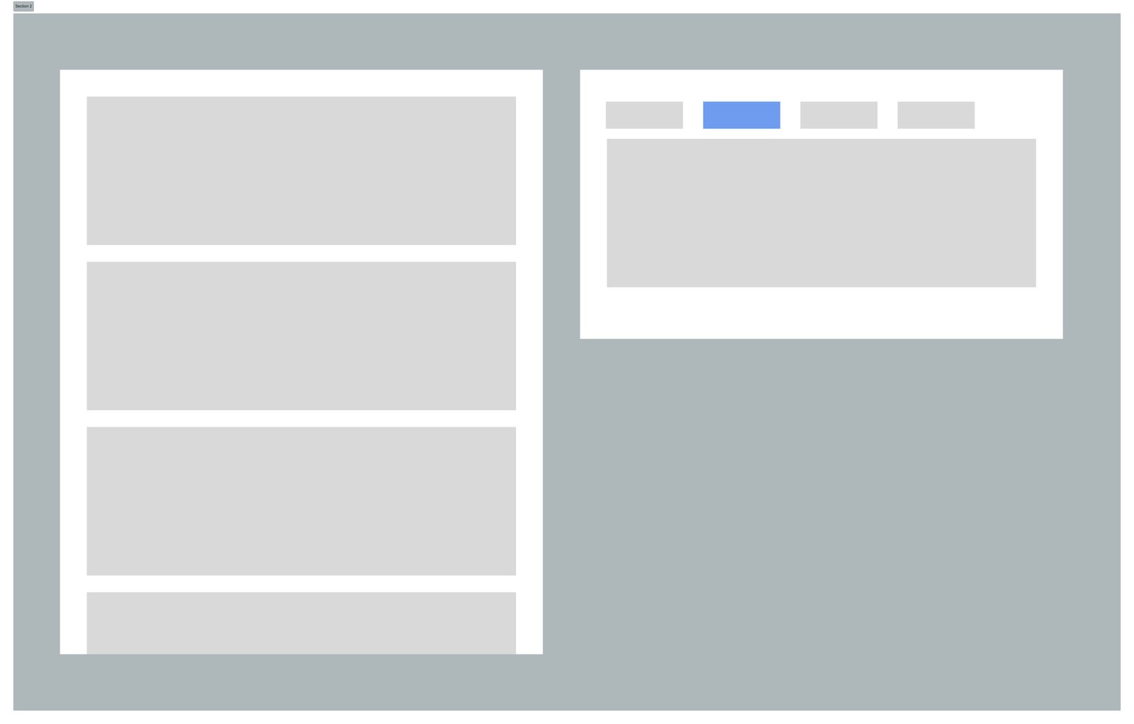
Consider the above: on the left, a layout with a long, linear row of content sections, versus the right: an opinionated, tabbed layout that uses hierarchy to determine and show what’s important (most important tabs on the left), as well as progressive disclosure to structure how information is revealed to the user. By giving more opinionated structure to the user, they get an implicit understanding of what’s important, and I would argue it is easier to find their way around the app with better signposting.
A sign in products that a navigation structure has become too linear is when a product has back buttons. If you are putting back buttons into your desktop app, you have probably created a structure that’s too deep and linear, which should probably be rethought to make better use of a side panel or top bar navigation. Back buttons are fine in principle, and certainly needed in mobile navigation where a permanent menu takes up too much screen space, but in web applications and web pages the user has access to system level back and forward buttons, so utilise those if you have to.
When to use linear navigation structures
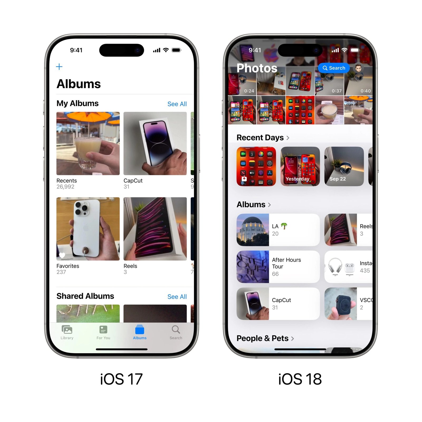
Linear navigation is not totally redundant in 2025. Linear structures could be used in discovery, letting users scroll a long list of different sections. Apple have also decided with their iOS 18 Photos App to use a linear structure, replacing the tabs that came before. The thinking here could be to let users discover different types of photo categorisation, e.g. by faces in the photo, maps of where photos where taken etc. This “single view” hasn’t been particularly popular – probably a general feeling of users not liking change, but also people recognising a loss of signposting and “always visible” navigation – the tab bar.

Displaying menu options to users in a navigation that is always open helps users understand what is available to them, and easily access different parts of the app. Thinking about the structure and hierarchy using a side navigation system will help you create a hierarchical layout system for users.
Allowing the users to do things in a different order while not getting lost is a powerful and product-thinking approach to designing interfaces. It leverages the power and functionality of modern navigation or single-page application technology when building for the web.
