
Ever landed on a website or opened an app and immediately felt meh? Maybe it looked outdated, cluttered, or just didn’t feel easy to use. Now think of a time when you landed somewhere and instantly thought, Wow, this is nice. That feeling? That is great design.
First impressions happen fast. We’re talking milliseconds. And in that time, a user is already deciding whether they trust your product, whether it’s worth their time, and whether they want to keep going or bounce.
Why First Impressions Matter
We like to think we’re logical creatures, but honestly, we judge books by their covers all the time. The same goes for apps, websites, and digital products. If something looks polished, clean, and intuitive, we assume it works well. If it looks clunky or outdated, we assume it’s frustrating to use. That’s the Halo Effect at play – good design makes people assume the whole experience will be good.
The First Touchpoint: Design as a Magnet
Your landing page is like a handshake. It should feel warm, inviting, and reassuring. People should know exactly what your product is and how to get started without hunting for answers.
Think of Apple. Their product pages are sleek, simple, and focused. You see the product front and center. There’s no confusion, no clutter – just a clear message that says, This is what we offer, and it’s amazing.
Or take Stripe. Their website isn’t just functional – it feels sophisticated and easy to navigate. That’s not an accident. It’s deliberate, thoughtful design that makes you trust the product before you’ve even used it.
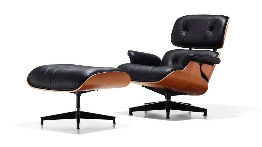
First Impressions and the Chair Test
Think about a chair. You can usually tell, just by looking at it, whether it’s comfortable, sturdy, or stylish – even if you’re not a chair expert. Your brain instantly compares it to your mental model of what a “good” chair should look like.
The same thing happens with software. If an app looks clean, modern, and familiar, users assume it’s easy to use. If it’s cluttered or confusing, they hesitate. Just like with a chair, people don’t need to sit in it (or use the software) for long before they form an opinion. First impressions set the expectation for the entire experience.
Onboarding: Friction vs. Exploration
The next big moment is onboarding. This is where companies either nail it – or lose people fast.
Some apps make you jump through a ton of hoops before you can even see the product. (Looking at you, endless sign-up forms.) Others let you dive right in, exploring the interface before committing.
Take Duolingo. The moment you open the app, you’re doing something – learning words, tapping on answers. No overwhelming tutorial, no friction. You’re engaged from the start.
On the flip side, some tools need a bit of guidance. Slack does this well by walking new users through its features in a way that feels interactive, not like homework. The key? Keep it light, keep it engaging, and get users to that “aha” moment fast.
Trust, Credibility, and the Little Details
Good design isn’t just about looking nice – it’s about feeling trustworthy.
Imagine a bank’s website with blurry images and mismatched fonts. Would you trust it with your money? Probably not. The same applies to any product.
- Clear hierarchy & typography = confidence
- Consistent colors and layout = professionalism
- Fast load times = reliability
Small design choices can make or break trust. Don’t underestimate them.
Quick Wins: How to Improve First Impressions
If you’re building (or revamping) something, here are some easy ways to make a strong first impression:
- Declutter your UI – Simplicity is key. Cut the noise and highlight what matters. Use an opinionated hierarchy.
- Optimize for speed – Slow load times kill interest fast.
- Use high-quality styling – No pixelated logos or stock images from 2010. Look at what’s happening in the design world and respond to that.
- Test your onboarding flow – Can users figure things out quickly?
- Make buttons and CTAs obvious – If people have to hunt for them, they won’t click them.
People judge digital products the same way they judge real-world experiences. If a restaurant looks sketchy from the outside, you’ll probably keep walking. If an app or site looks outdated or confusing, users will bounce.
The good news? Design is fixable. First impressions aren’t luck – they’re crafted. And the better you design that first touchpoint, the more likely people are to stick around, explore, and convert into loyal users.