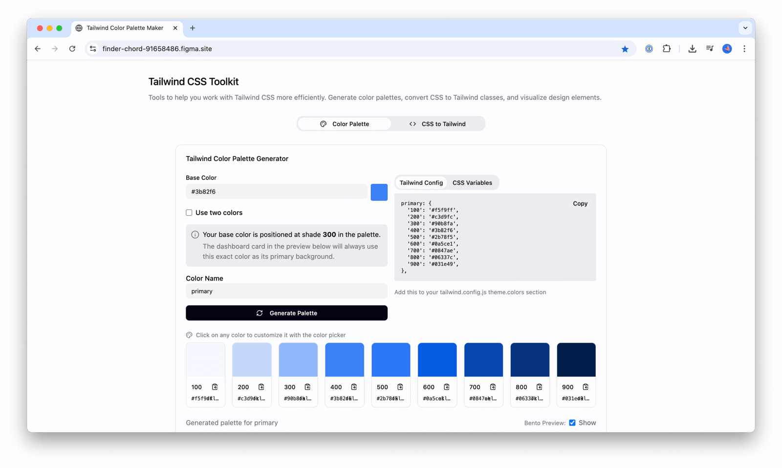
One of the first problems I encountered as a design engineer was sales teams wanting custom demos of software products. They were talking to large enterprise clients, and having a slick demo in client branding helped conversations and improved engagement in their sales process. Instead of redesigning our Agents Product every time, I started to use Tailwind Themes to think about what colours we should allow deployment teams to adjust. This meant using a theme tag in parts of the product with colour, e.g.
<div class="text-theme-500">Heading in theme colour</div>Then, in the app’s CSS file, defining the theme colours:
@import 'tailwindcss';
@theme {
  --primary-100: #f5f9ff;
  --primary-200: #c3d9fc;
  --primary-300: #90b8fa;
  --primary-400: #3b82f6;
  --primary-500: #2b78f5;
  --primary-600: #0a5ce1;
  --primary-700: #0847ae;
  --primary-800: #06337c;
  --primary-900: #031e49;
}
This allows for easy changing across deployed demos. Creating this colour palette then became the bottleneck and so I created a lightweight colour palette generator to create the palette based on one brand colour. This was created with a few prompts on Figma Make. You can visit the live Tailwind colour palette generator here. I expanded it to include some demo UI components, and a way to convert CSS (e.g. generated by Figma dev mode) into default Tailwind classes.

