

Good typography is a cornerstone of excellent visual design. Its influence extends far beyond aesthetics. The principles that guide effective typography – such as hierarchy, structure, and clarity – are also essential to building great products. By understanding typography, product designers can learn to organize information better, provide clearer direction, and ultimately create more user-friendly experiences. Let’s look at that in more detail.
1. Typography Teaches Hierarchy and Information Design
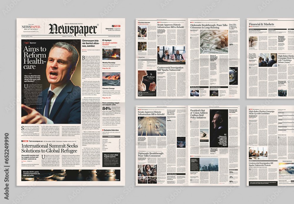
At its core, good typography is about communicating. Structural elements like headings, paragraphs, chapters help users navigate content by establishing a clear hierarchy. This hierarchy tells users what’s important, what’s secondary, and what’s optional. In product design, the same principle applies. The way you design and arrange interface elements influences how users process information and understand what to do next. Think about print layouts that communicate a lot of information. Newspapers (generally) use a great combination of headlines, sub headings, paragraphs, images to signpost and guide users around the page who are often busy and scanning the page to look for particular information of interest.
Consider a landing page for a productivity app. The most prominent headline should communicate the primary value proposition. Subheadings and body text provide supporting details. Buttons and calls-to-action (CTAs) direct users toward taking the next step. Without this structure, users might get lost or overwhelmed.
Typography uses size, weight, color, and spacing to create visual distinctions. In product design, similar tools can help prioritize information and guide users effectively.
Signposting and Wayfinding
Just as typography uses headers, subheaders, and paragraph styles to signal content structure, product design relies on visual cues to help users navigate interfaces. Icons, headings, and labels all work as signposts to help users find what they need.
Good typography makes this wayfinding seamless. Similarly, in product design, thoughtful use of visual hierarchy ensures that users know where they are, what’s important, and where they should go next.
2. Hierarchy is About Providing Opinionated Direction
Hierarchy in typography isn’t just about making text look organized; it’s about providing direction. By making some elements stand out more than others, you’re telling the user where to look first. This concept of “opinionated direction” also applies to product design.
In a digital product, opinionated design means guiding users toward the most important actions or information. Instead of presenting everything at once, the interface reveals what’s relevant at each step.
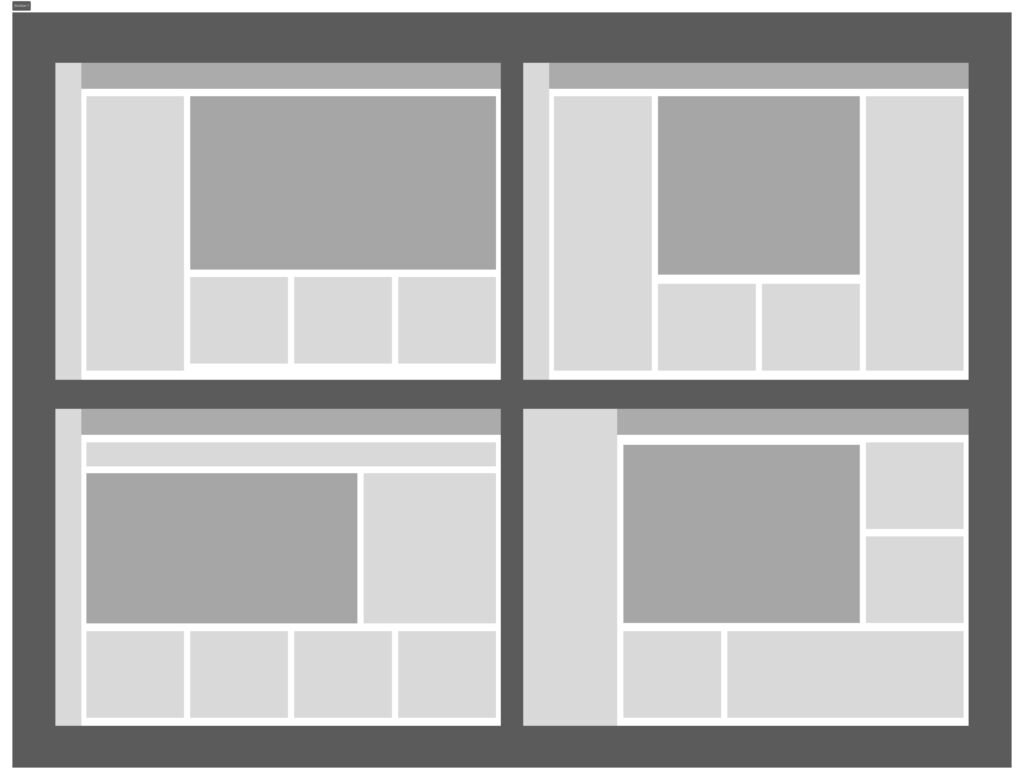
Consider how size and colour affect where your eye is draw to in these example layouts. Creating a hierarchy in your layout will provide the user information on what is important.
Progressive Disclosure
This is where the concept of progressive disclosure comes in. Progressive disclosure is a technique where you show essential information upfront and provide additional details as needed. It keeps the interface clean while ensuring users get more information when they want it.
For example, in a mobile banking app, the initial screen might show account balances and recent transactions. More detailed financial insights or settings are hidden behind expandable sections or additional screens. This approach respects user attention and reduces cognitive load, just like a well-structured article that doesn’t bombard readers with too much information at once.
Good typography naturally supports progressive disclosure. Headings introduce topics, and details are revealed in smaller text. Product design can emulate this by showing the most critical features first and allowing users to uncover more as needed.
3. Applying Hierarchy in Your Design Process: The Weighting Exercise
Creating a strong hierarchy in product design isn’t always intuitive. That’s where a weighting exercise comes in handy.
What is a Weighting Exercise?
A weighting exercise involves ranking features or elements based on their importance. This helps you decide how prominent each element should be in your design.
How to Do It:
- List your key elements: Write down all the features, actions, and information that need to appear in your interface.
- Rank their importance: Assign a priority to each element. For example, on an e-commerce product page, the “Add to Cart” button might be top priority, followed by product images and descriptions.
- Match visual weight to priority: Elements with higher priority should have greater visual weight. Use size, color, and position to make these elements stand out.
This exercise mirrors the way typographers decide which text needs to be large and bold, and which can be smaller and lighter. Applying this to product design ensures that your interface guides users to the right information and actions.
Example in Action
Imagine you’re designing a task management app. After your weighting exercise, you might decide the following hierarchy:
- Main tasks list: Highest priority; should be prominent and easy to scan.
- Add new task button: Very important; should be easy to find.
- Filters and search: Useful, but secondary to the main tasks list.
- Settings: Low priority; can be tucked away in a menu.
By following this hierarchy, you ensure users can quickly understand what the app does and how to use it effectively.
Conclusion
Typography isn’t just about making words look good; it’s about communicating information clearly and effectively. The principles of hierarchy, opinionated direction, and progressive disclosure are just as valuable in product design as they are in typography.
By applying these principles, you can create products that are not only functional but also intuitive and user-friendly. So the next time you’re designing a feature or interface, think like a typographer. Prioritize your information, guide your users, and structure your design thoughtfully – your users will thank you.