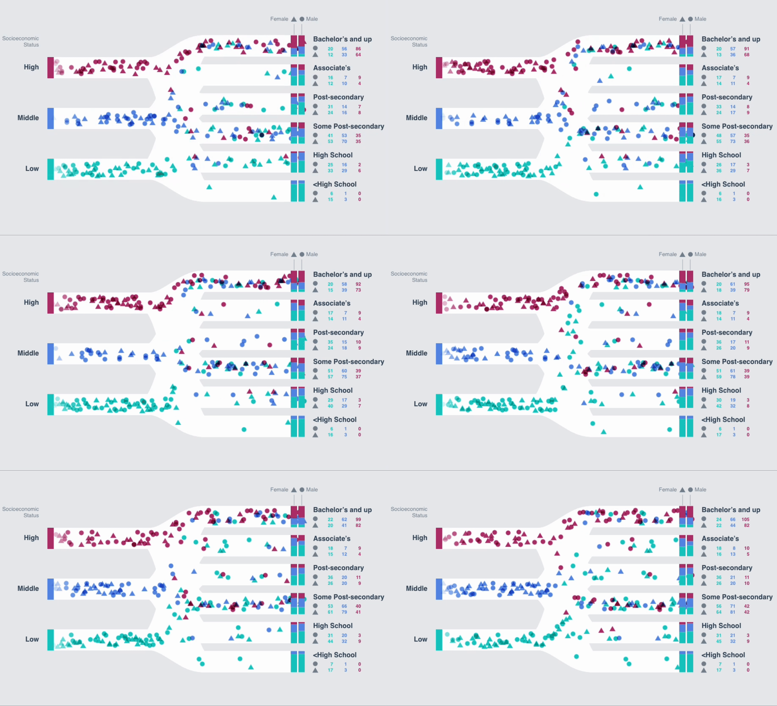
Dynamic Interaction or dynamic interactivity in terms of user interface design refers to the real-time, responsive relationship between a user and a system where the interface reacts or evolves based on user input or changing data. It’s about creating an experience where users can directly manipulate elements, see immediate effects, and engage with data in a more intuitive, immediate manner.
Think of it as moving beyond static dashboards to interactive, living canvases that respond to your touch or thought, much like Bret Victor describes when he says, “Users want direct manipulation of the pictures in their heads.” This approach not only enhances user engagement but also creates a deeper understanding through manipulation of information, making the interaction with technology feel more natural and insightful.
Users want direct manipulation of the pictures in their heads
Bret Victor
Where does it come from?
I have been going back into some old work by Bret Victor. It’s been such a reminder of what’s possible when we think beyond the usual tools.
When it comes to visualising data, we often go to Excel, maybe Adobe Illustrator, or sometimes D3.js. These are great, but it feels like we often get caught in what’s familiar. The sky’s the limit when it comes to creating something truly engaging and interactive. Sure, there are always considerations like ease of use and familiarity, but I really believe that something good should feel natural to use. If the visualisation works well, it can feel almost intuitive.
Bret Victor, a visionary in human-computer interaction, has famously said, “Users want direct manipulation of the pictures in their heads.” This quote is spot on and gives way to dynamic interaction, particularly showcased in his talks like “Drawing Dynamic Visualizations” and “Inventing on Principle.” It means start with where the user is – their current imagery, visuals and data. Then make it interactive. Use their existing representations they are familiar with and work out how to make it come alive.

Drawing Dynamic Visualizations
In his talk Drawing Dynamic Visualizations, Victor presents a tool where one can create data-driven graphics by directly manipulating the visual elements. Imagine sketching out a visualization and having it come to life, responding to data changes or user interactions in real-time. This isn’t just about making things pretty; it’s about making them understandable and editable in ways that traditional methods can’t match.
The concept here is to blend the immediacy of drawing with the precision of programming. Victor demonstrates a system where you can draw, for instance, a line graph and then link its behavior directly to underlying data. Adjusting one part of your sketch can dynamically change the whole visualization, providing an instant, intuitive understanding of data relationships. This kind of interaction allows users to explore data visually in a way that feels like you’re conversing with the information itself.
Inventing on Principle
In “Inventing on Principle,” Victor explores the idea that every creator should have a direct, immediate connection to their creative process. He advocates for tools that allow creators to see the impact of their work in real-time, fostering an environment where ideas and their visual representation evolve together. This principle is especially vital in data visualization, where the goal is to reveal insights or tell stories with data.
Practical Implications
- Intuitive Learning: By allowing direct manipulation, users can learn through doing. It’s not just about seeing data; it’s about interacting with it, which can make complex data concepts more accessible.
- Engagement: Dynamic visualizations can turn passive data consumption into an active, engaging experience. Users feel more connected to the data because they can see and control how it’s presented.
- Innovation: With tools inspired by Victor’s work, we could move beyond static charts to visualizations that adapt to user interaction or even to new data sets without the need for extensive reprogramming.
Off the back of this, I started going beyond Echarts to experiment with D3.js, which offers some of the dynamism Bret Victor advocates for in data visualization through more direct manipulation of SVG (vector graphics). However, Victor’s vision pushes further, suggesting a future where we might not even need to write code to manipulate complex data sets visually. D3 and Echarts lets users see animated data, and then begin to manipulate it in realtime.

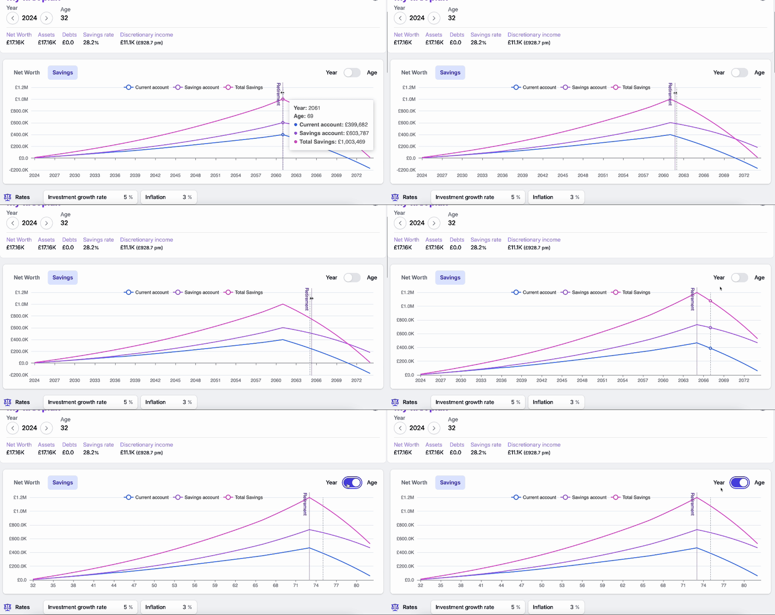
To put this into practice, I’ve been working on Wealthlytics, a novel way to visualise and interact with your financial future. Have a look and send me some feedback. This gif is from Wealthlytics:

I would love to hear if anyone else has been experimenting with or thinking about how we present data in weirder, interactive ways. How can we make our data not just visually appealing but also dynamically interactive?
